FreshWebz Web Design Colchester

Affordable Web Design Colchester

Email : enquiries @ freshwebz.co.uk
  • Home
  • About FreshWebz
  • Web Services
    • Domain Name Registration
    • Web Hosting Services
      • Super-fast WordPress Hosting
    • Web Design
      • Responsive Web Design
      • WordPress Website Design
        • Super-fast WordPress Hosting
    • Ecommerce Website Design
      • Bigcommerce Websites
  • SEO
    • SEO Website Audit
  • Portfolio
    • Client Sites
    • Our Websites
    • Projects
    • Old Websites
  • Prices
  • Contact Us
  • Blog

Is your Site Mobile Friendly?

May 18, 2017 By freshwebz

Mobile Friendly, Responsive Website Design

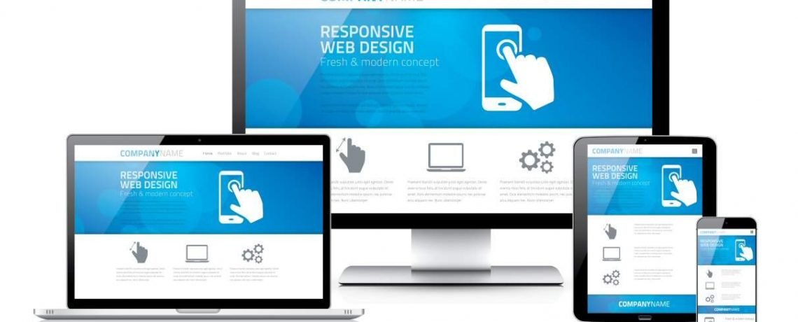
Is your site mobile-friendly? When we say this we mean does your website work well on devices with smaller screens than traditional desktop/laptop computers? Not only is this important from a user's point of view, but the search engines now include mobile-friendliness as one of their metrics when deciding where you should appear in their search results.

In the UK, when we say "Search Engine", we pretty much mean "Google". As at April 2017, Google had the highest market share of search by far, with 85.74% of the desktop, tablet and console search engine market here. After Google comes Bing, with a market share of 10.07%, followed by Yahoo! with 3.16%.*

So, if you want your site to rank well in Google, one of the elements you need to get right, is mobile friendliness i.e. whether your site displays well on smartphones and tablets!

Why Does Being Mobile Friendly Matter?

Google Likes It

If you want your site to do well on search engines, you have to make sure you meet their standards and in April 2015, Google included mobile-friendliness in its algorithm, providing a significant edge to mobile search rankings of web pages that are mobile friendly.

responsive web design


Users Like It

In late 2016, the number of people using mobile and tablet to browse the Internet exceeded the number using desktop for the first time!** The figures for the younger generation far outweigh those of older people, so this statistic is only going to increase over time. People that visit a non-mobile friendly site via mobile/tablet will generally:

  • spend less time browsing the site (smartphone users are quick to give up on a website they can't read properly)
  • be less likely to perform any desirable actions (such as making a purchase or contacting you)
  • be more likely to return back to the search engine results (to find/visit another website)

This means that even if your site is found on search, if it isn't mobile-friendly, over 50% of visitors are less likely to engage with your business.

How Do you ensure an effective Mobile Responsive site?

Google says there are 3 main things that you should consider when building a Mobile Friendly site:

  • Ease of use for site visitors: The site design should be able to self explain the site flow and objective so that a visitor is able to easily accomplish their common tasks. In other words, streamlining the user experience and reducing the number of user interactions to accomplish a given task
  • Measuring the effectiveness of the above Ease of Use
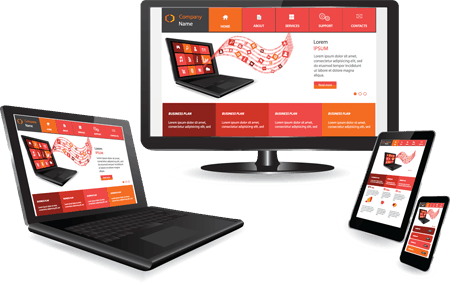
  • Developing the design such that one site works on all devices (i.e. Desktop, Laptop, Tablets and Mobiles) rather than making separate sites for each device as happened only a couple of years ago. Known as Responsive Design, the site design automatically adjusts in accordance to the screen size of the device.
Check to see if your current website passes the mobile friendliness test, using Google's Mobile Friendly Test tool.

Website is Mobile Friendly

Better Websites

As already mentioned, with the advancement of mobile technology, the number of people using Mobile Devices to browse the Internet is increasing year by year. But clearly there are still many people still using the traditional desktop/laptop, so it's vital that your website works effectively on all screen sizes/resolutions (big and small). Ignoring market trends could be a blunder for any company's Internet presence, as a bad mobile experience will have your customers jump to your competitors instead. Whilst Responsive Web Design isn't the only thing that drives sales, having a site that functions well on multiple devices is essential for a good user experience; which keeps more visitors on your site and usually results in more sales.

Where can I find help?

If you've checked whether your site is mobile-friendly and have found that it isn't, contact us to help improve your sites appearance and functionality on mobile devices. Whether it's making your existing site more responsive, redesigning your site from scratch or just providing your options, we can give give you the answers to bring about a positive impact on your business. We can work with you, to create an attractive site that uses the latest web technologies to look good on a range of devices and deliver a superior experience to visitors.

Contact us now if you would like assistance on responsive design or any other web development needs.
*Source : https://www.statista.com/statistics/280269/market-share-held-by-search-engines-in-the-united-kingdom
**Source : http://gs.statcounter.com/press/mobile-and-tablet-internet-usage-exceeds-desktop-for-first-time-worldwide

Filed Under: Google, Mobile Search, Responsive Web Design, Search Engine Rankings, SEO, Web Design

Upcoming mobile changes to Google’s ranking algorithm for searchers on mobile devices

March 9, 2015 By freshwebz

From 21st April, Google will be expanding the use of mobile-friendliness as a ranking signal. This change will have a significant impact in search results and users will find it easier to get relevant, high quality search results that are optimised for their devices.

So much website traffic is now coming from smartphones and tablets, Google is assessing all sites in its index for mobile friendliness and this change will be be pushed into its algorithm on that date.

When determining if a website is mobile friendly, Google bases this on a page by page case and all pages must be mobile friendly. Creating some pages, even the majority of pages, as mobile friendly will not mean your entire site passes the check.

Responsive websites adjust to suit whatever device you are using

Your site must allow Google to crawl CSS & javascript

If you are blocking elements such as CSS and javascript, your site will not pass Google’s mobile friendly test, even if everything else on the site passes.

Because Google has been pushing responsive design as a way to handle mobile traffic, some have speculated that it will receive a ranking boost over and above other types of mobile optimisation. However, Google says that they only recommend it because it works well for Google, so they believe that solution will work for almost everyone else. Other systems of mobile adaptation will not be treated as second class.

You can find out if your site is ready for this change by using the following tools to see how Googlebot views your pages:

  • If you want to test a few pages, you can use the Mobile-Friendly Test.
  • If you have a site, you can use your Webmaster Tools account to get a full list of mobile usability issues across your site using the Mobile Usability Report.

To get help with making a mobile-friendly site, check out Google's guide to mobile-friendly sites, or contact us to discuss our responsive web design services.

Filed Under: Google, Mobile Search, Responsive Web Design, Search Engine Rankings

FreshWebz Web Design Colchester

We are a web design company specialising in working with small to medium-sized businesses. We offer high quality website design, as well as a range of other online web services, for any individual, sole trader, small business, SME or UK company. Our services are geared to both new and established business owners requiring a professional, affordable website design solution with local on-going Colchester based support. Contact us for an informal chat, to see how we can improve your business' web presence!

Contact Us Today!

Contact Us

FreshWebz Web Design
E : enquiries @ freshwebz.co.uk

Who We Are

We are a Colchester Web Design company, specialising in creating Affordable Websites for Sole Traders, Start-Ups and Established Small Businesses in Colchester and surrounding areas. We provide Affordable Web Design, Mobile Friendly / Responsive Websites, CMS Websites and eCommerce Websites that are affordable, professional and easy to use. Visit our Web Services page to find out more about what we can offer your business.

Recent Posts

  • Is your Site Mobile Friendly?
  • New Website Development Project for JS Leisure
  • WordPress Malware Scanning Now Powered by Sucuri SiteCheck in iThemes Security
  • How to make positive changes to a web page

Copyright © 2026 · Outreach Pro On Genesis Framework · WordPress · Log in